4 Comparing groups
Perhaps the most important consideration when plotting is to ask:
What is the most interesting thing in this graph?
This chapter is about arranging a plot around the comparison you actually care about. We will discuss a powerful technique of splitting graphs into small multiples, with facetting, and discuss how to arrange plots by position.
Overview
Duration 48 minutes
Questions
- Why can I not answer my own question from this plot?
- How do I split one plot into small multiples?
- What changes when I swap colour for facets?
- How do stacking, dodging, and filling change what a bar chart says?
- When should panels share a scale?
What you need this session
- A session of RStudio open
- Something to draw on, and something to draw with
- The following packages installed
4.1 Where is busy on a weekend?
We are using the pedestrian data again in this chapter, and the question for the chapter is this one:
Where is busy on a weekend?
Start with totals
In Chapter 3 we used geom_col() to draw a column (bar).
For each place, and each kind of day (weekday, weekend), how many people walked past in all of 2016?
# A tibble: 8 × 3
sensor_name day_type total
<chr> <chr> <int>
1 Birrarung Marr weekday 2360144
2 Bourke Street Mall (South) weekday 7207024
3 Flagstaff Station weekday 7382525
4 Spencer St-Collins St (South) weekday 2364947
5 Birrarung Marr weekend 1614197
6 Bourke Street Mall (South) weekend 2846277
7 Flagstaff Station weekend 421244
8 Spencer St-Collins St (South) weekend 472174This contains the parts from from Chapter 2 and Chapter 3:
library(tidyverse)
library(naniar)
pedestrian_totals <- pedestrian |>
mutate(day_type = if_else(
condition = str_starts(week_day, "S"),
true = "weekend",
false = "weekday"
)
) |>
group_by(sensor_name, day_type) |>
summarise(
total = sum(hourly_counts, na.rm = TRUE),
.groups = "drop"
) |>
arrange(day_type, sensor_name)
pedestrian_totalslibrary(tidyverse)
library(naniar)
pedestrian_totals <- pedestrian |>
mutate(day_type = if_else(
condition = str_starts(week_day, "S"),
true = "weekend",
false = "weekday"
)
) |>
group_by(sensor_name, day_type) |>
summarise(
total = sum(hourly_counts, na.rm = TRUE),
.groups = "drop"
) |>
arrange(day_type, sensor_name)
pedestrian_totalsI want to explore how arranging the information in a graph changes your interpretation - so we will draw two:
Sketch a bar chart to explore: where is busy on a weekend.
Sketch a bar chart that explores arranging the bars to mean something different.
Two minutes! One minute per chart - just quickly.
Let’s discuss our sketches.
4.2 Bar charts: stack, dodge, and fill
We can look at the counts per day type, we can do:
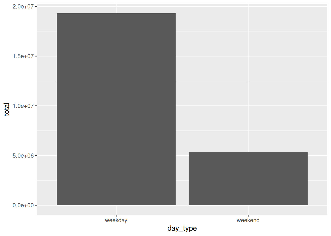
And we can make a regular bar chart of the week type and the total count like so:
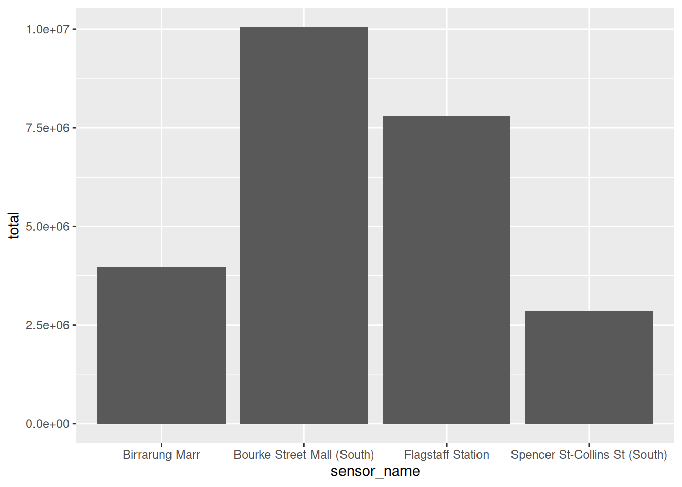
Let’s move these sensor names onto the y axis to make them easier to read:
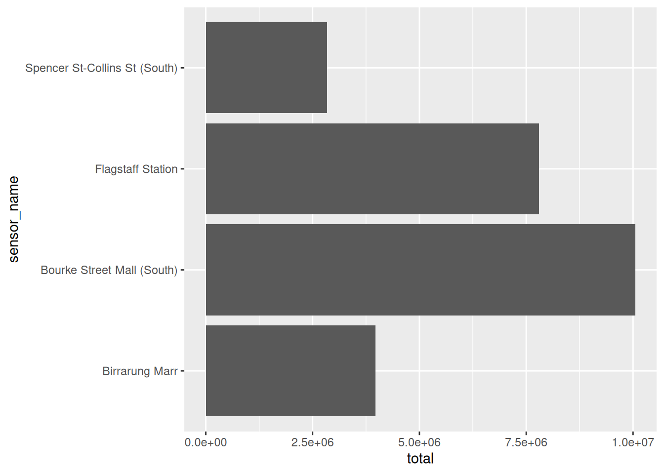
If we want to colour this by the weekday type, you can map one of these variables to fill:
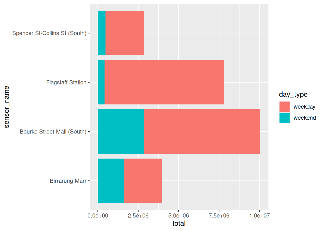
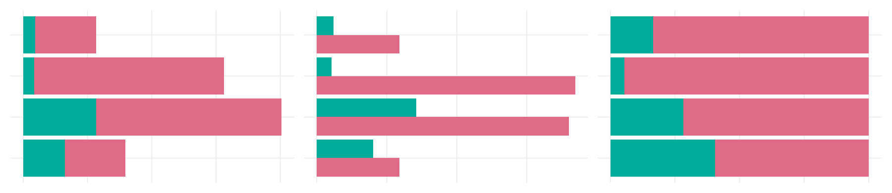
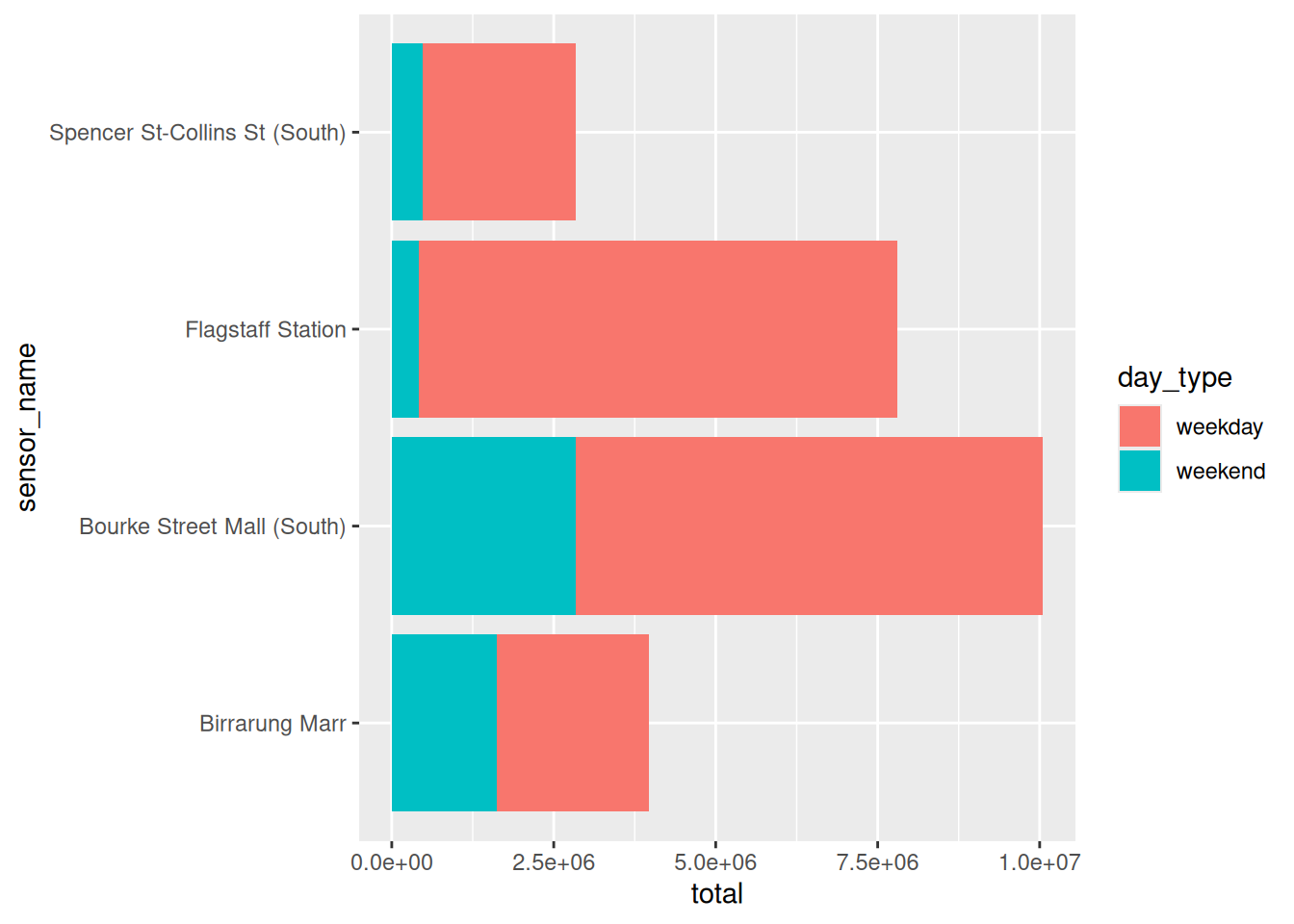
Notice the bar heights are the same across these two? The position sums up these two numbers. This is called “stacked”.
Now, there are a few different ways to position bars - you set this with the position argument inside of geom_col(): stack, dodge, and fill.
Let’s go through them.
position = “stack”
This is the default in ggplot2: stacked barplots. You can change set this with position = "stack", but this is the default:
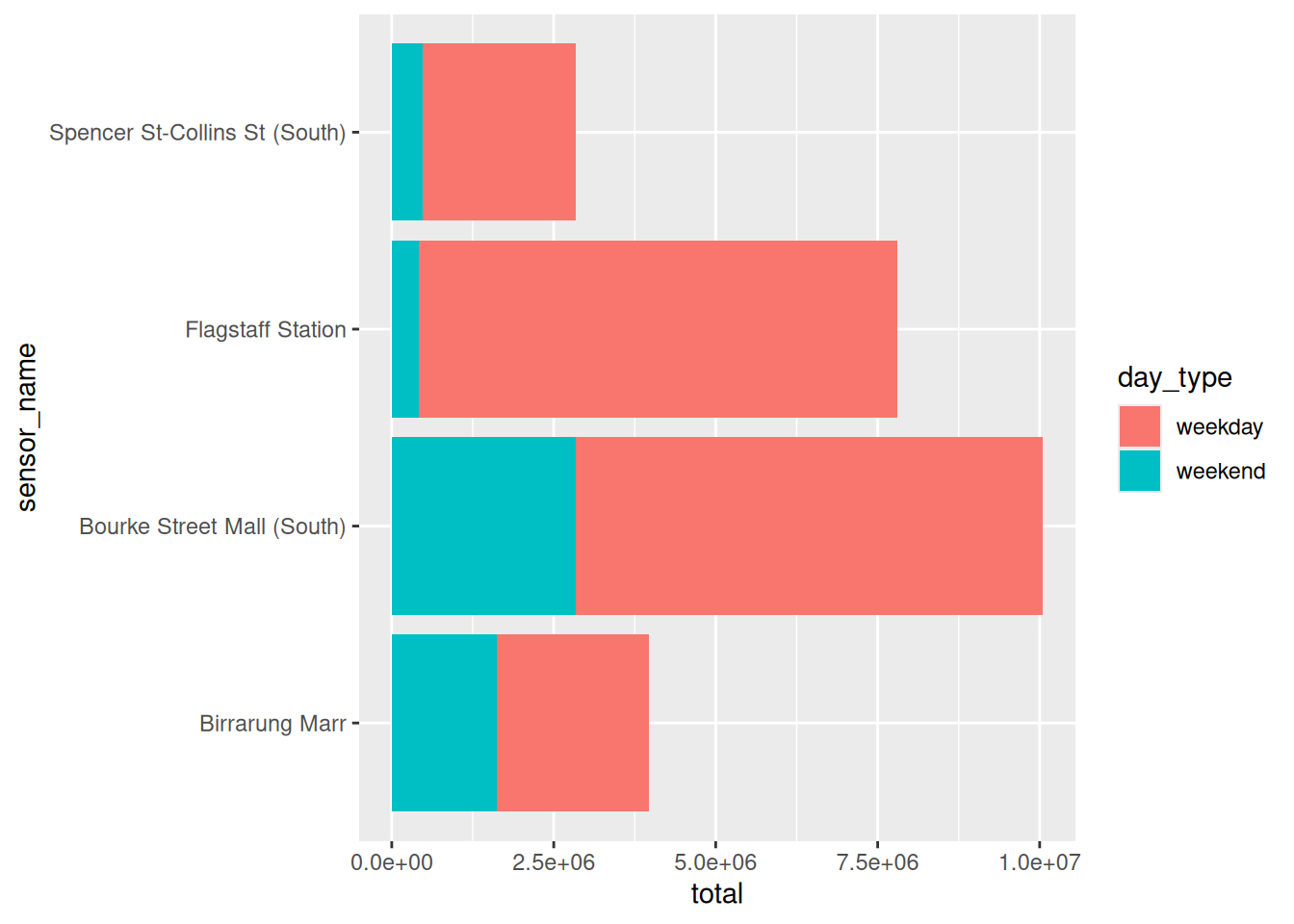
These are useful for comparing the total. The comparison of the day types against each other is harder, because the position doesn’t line up. We can sense that the weekends are less than the weekdays, which makes sense, but it is harder to see by just how much.
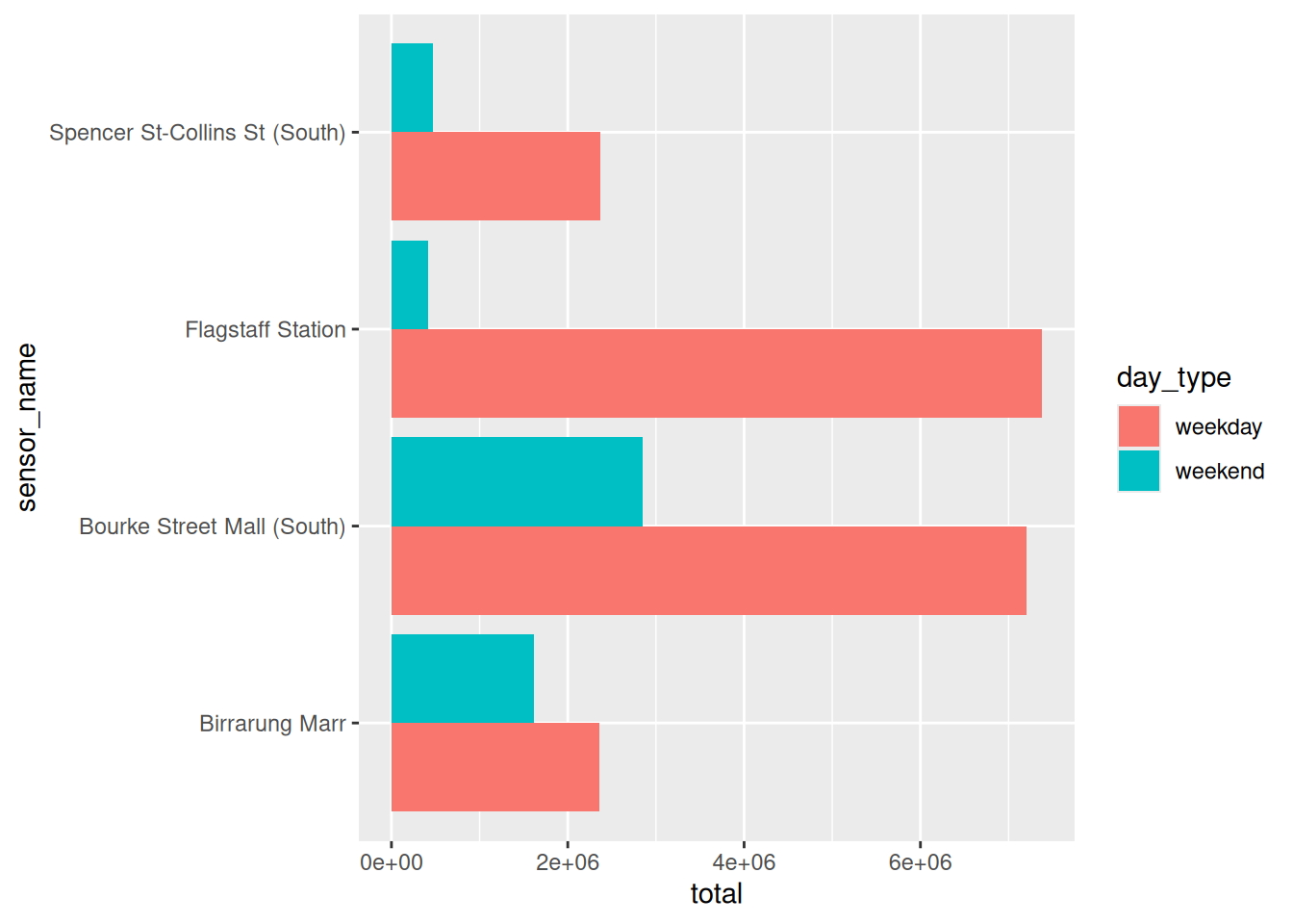
position = “dodge”
This dodges the bars, so you can compare the fill category directly. You don’t get the total of each sensor name, but now you can directly compare the weekday and weekend to each sensor.
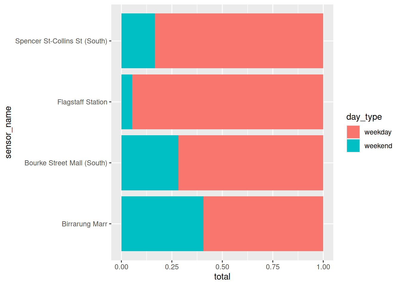
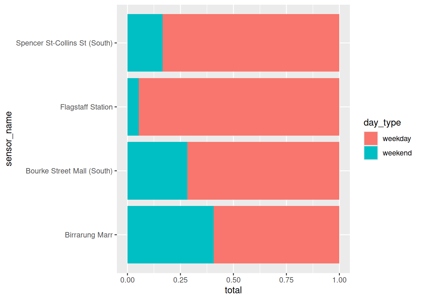
position = “fill”
Makes every bar the same height, so proportion is easy, but you trade off counting the number.
So let’s get back to our question:
Where is busy on a weekend?
Which plot helps us answer this?
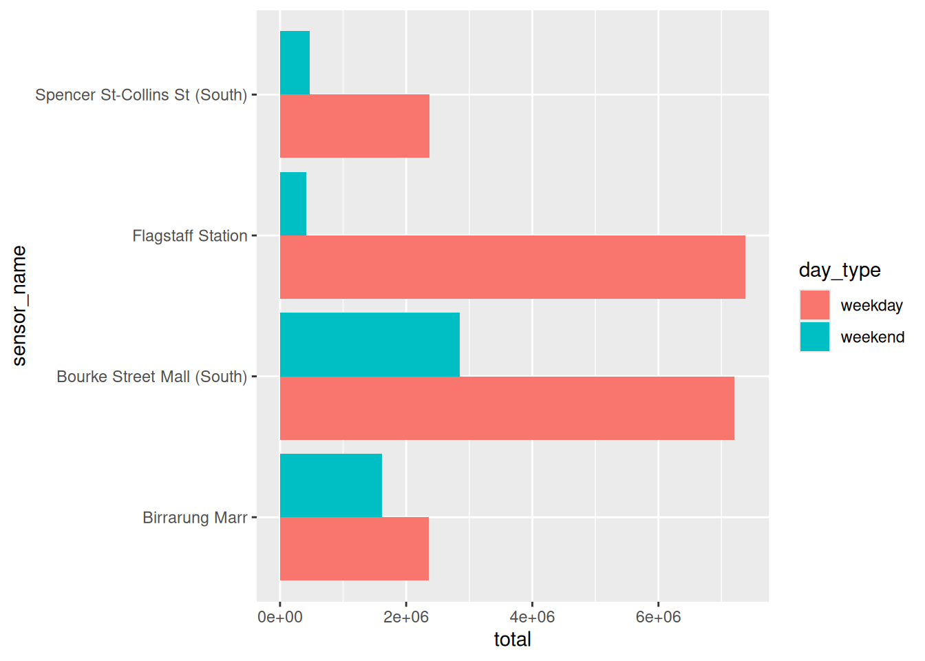
- The dodged says Bourke Street Mall, which has the most weekend foot traffic
- Filled says Birrarung Marr, where a higher percentage of all foot traffic happens on a weekend, compared to Bourke Street Mall.
There isn’t a “right” plot, per se - these each answer slightly different questions - one is more about the total count, one is about the proportion.
I ran into a similar problem making population pyramids, and wrote it up in Population Pyramid Plots in ggplot2.
Plotting raw population counts for Brisbane and Hobart answers “these two cities are different sizes”, and the question I actually had was “do these two cities have similar age distributions?” Brisbane drowned out Hobart entirely until I switched to per capita.
library(tidyverse)
library(naniar)
pedestrian_totals <- pedestrian |>
        mutate(day_type = if_else(
                condition = str_starts(week_day, "S"),
                true = "weekend",
                false = "weekday"
                )
        ) |>
        group_by(sensor_name, day_type) |>
        summarise(
                total = sum(hourly_counts, na.rm = TRUE),
                .groups = "drop"
        ) |>
  arrange(day_type, sensor_name)

pedestrian_totalslibrary(tidyverse)
library(naniar)
pedestrian_totals <- pedestrian |>
mutate(day_type = if_else(
condition = str_starts(week_day, "S"),
true = "weekend",
false = "weekday"
)
) |>
group_by(sensor_name, day_type) |>
summarise(
total = sum(hourly_counts, na.rm = TRUE),
.groups = "drop"
) |>
arrange(day_type, sensor_name)
pedestrian_totalsWhat happens if you use different variables in “fill” - e.g.,
fill = sensor_name?Try
position = "dodge2". What changed?Flagstaff Station is 5% weekend. Which of the three plots makes that easiest to see?
The sensors are in alphabetical order - it’s the default, but we can make it better. Let’s use reorder(), to sort one variable by another. We place this inside aes():
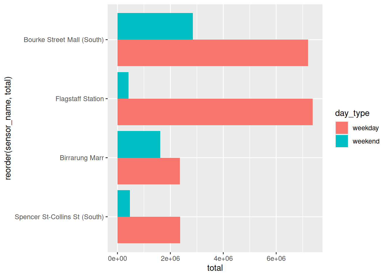
The bars now read as a ranking rather than a lookup table.
reorder(sensor_name, total)for busiest overall at the topreorder(sensor_name, -total)to flip it - lowest at the top- alphabetical, when the reader needs to look something up rather than compare
If you want to reorder by a specific variable within that, you can do it manually - you would be best to identify the
# A tibble: 4 × 3
  sensor_name                   day_type   total
  <chr>                         <chr>      <int>
1 Bourke Street Mall (South)    weekend  2846277
2 Birrarung Marr                weekend  1614197
3 Spencer St-Collins St (South) weekend   472174
4 Flagstaff Station             weekend   421244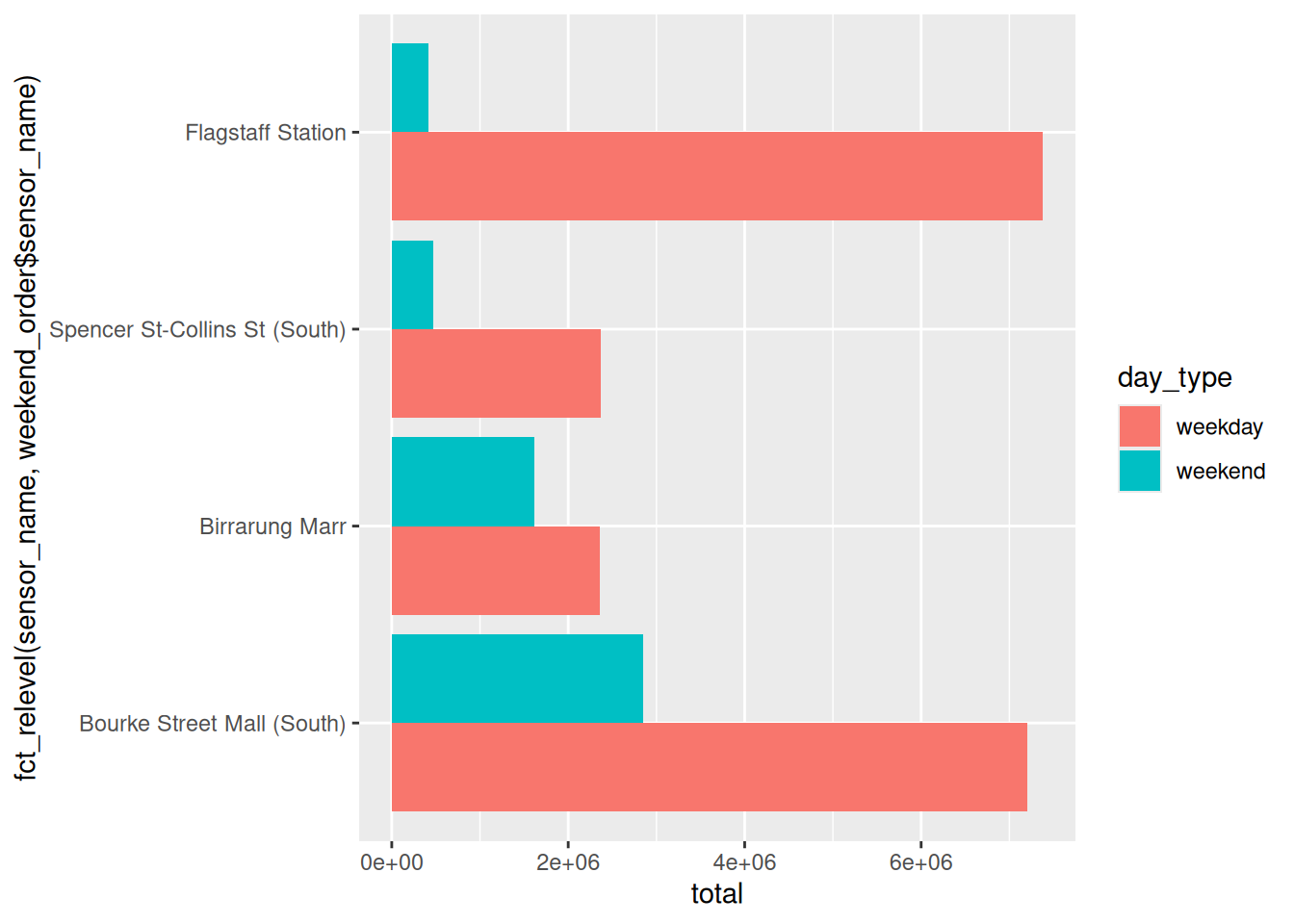
We come back to ordering properly in Chapter 6.
4.3 Looking across the whole day
To explore the whole day now - rather than summarising per day, let’s go back to one number per place, per kind of day, per hour.
# A tibble: 192 × 4
   sensor_name    day_type  hour mean_count
   <chr>          <chr>    <int>      <dbl>
 1 Birrarung Marr weekday      0       51.6
 2 Birrarung Marr weekday      1       22.7
 3 Birrarung Marr weekday      2       14.8
 4 Birrarung Marr weekday      3       12.7
 5 Birrarung Marr weekday      4       14.4
 6 Birrarung Marr weekday      5       41.8
 7 Birrarung Marr weekday      6      168.
 8 Birrarung Marr weekday      7      428.
 9 Birrarung Marr weekday      8      676.
10 Birrarung Marr weekday      9      373.
# ℹ 182 more rows
The average number of people who walked past one of the four sensors, each hour, on a weekday or weekend.
library(tidyverse)
library(naniar)
pedestrian_hourly <- pedestrian |>
        # a weekday/weekend column. The only two days starting with
        # "S" are the two we want
        mutate(day_type = if_else(
                condition = str_starts(week_day, "S"),
                true = "weekend",
                false = "weekday"
                )
        ) |>
        group_by(sensor_name, day_type, hour) |>
        summarise(
                mean_count = mean(hourly_counts, na.rm = TRUE),
                .groups = "drop"
        )

pedestrian_hourly
There are 37,700 rows and only 24 hours in a day, so drawing a line straight from pedestrian sawtooths: one line running out to hour 23 and back to hour 0, once for every day of the year.
More on that trade off at the end of the chapter.
Now put it all on one plot: for each hour, the average count, for each sensor, and each day type:
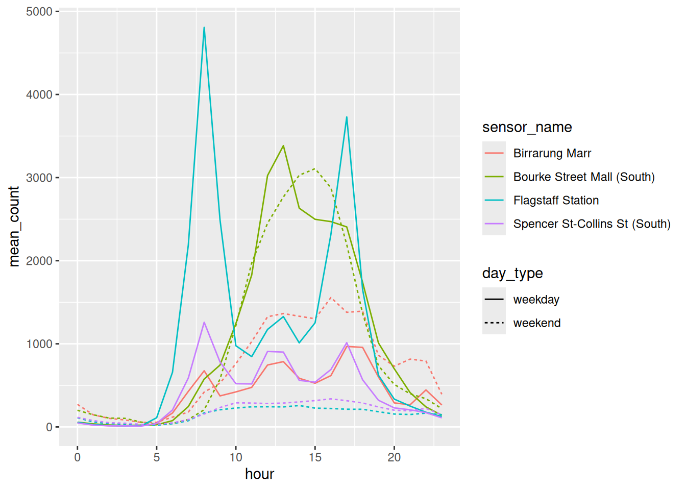
It’s a bit crowded!
Answering:
where is busy on a weekend
means:
- finding the dashed lines
- matching four colours against a legend,
- Checking the legend again because you have already forgotten…
It’s a bit of work!
Let’s split it into pieces. In ggplot2 that is called facetting.
library(tidyverse)
library(naniar)
pedestrian_hourly <- pedestrian |>
        # a weekday/weekend column. The only two days starting with
        # "S" are the two we want
        mutate(day_type = if_else(
                condition = str_starts(week_day, "S"),
                true = "weekend",
                false = "weekday"
                )
        ) |>
        group_by(sensor_name, day_type, hour) |>
        summarise(
                mean_count = mean(hourly_counts, na.rm = TRUE),
                .groups = "drop"
        )

pedestrian_hourly
How would you reshape this plot into something better? What gets in the way?
Draw an example better plot.
4.4 facet_wrap() and facet_grid()
We can use facet_wrap() and facet_grid() to split the plot into multiple sub-plots using facet_wrap() or facet_grid().
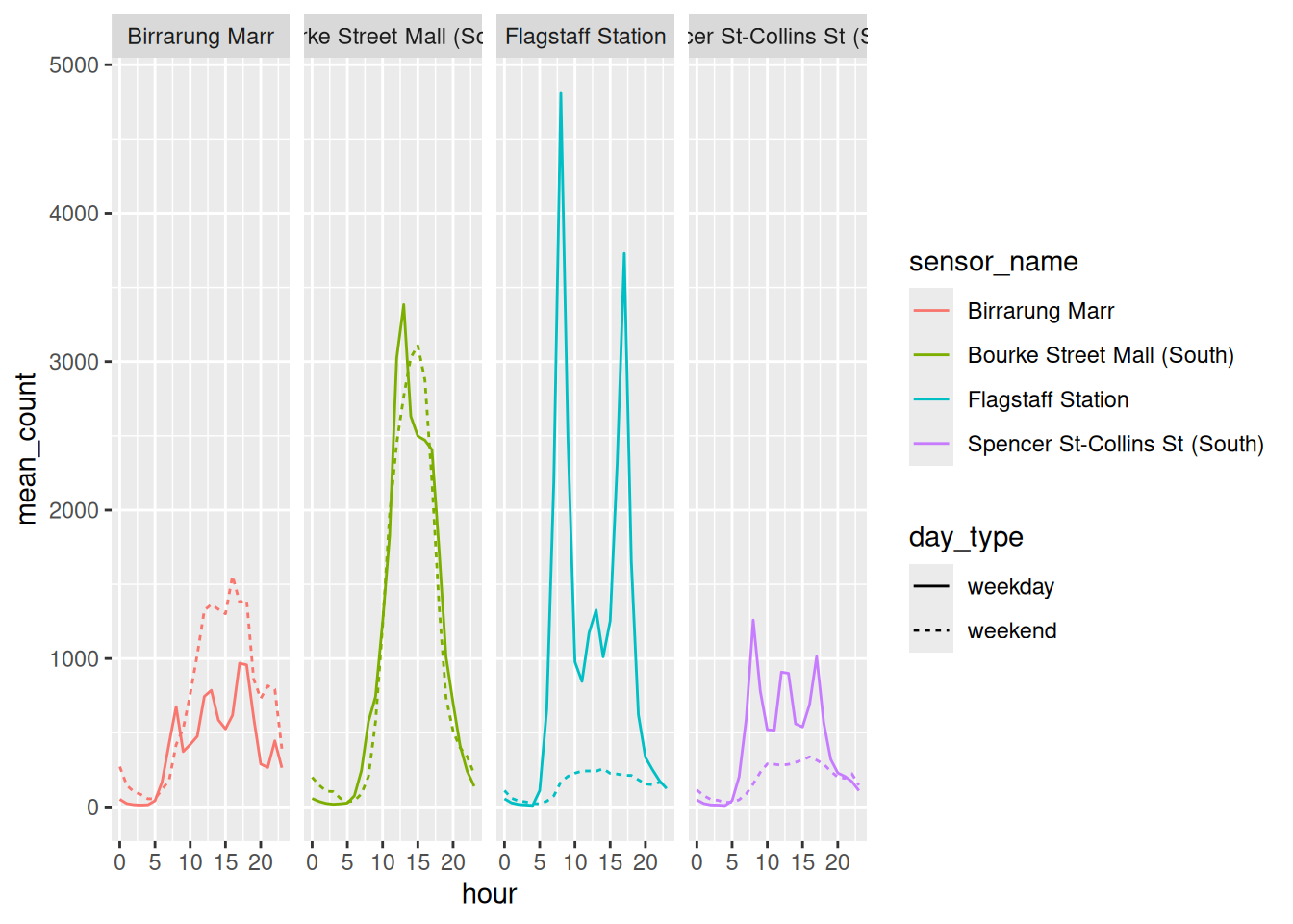
Here is the noisy plot from earlier, shown with facets added.
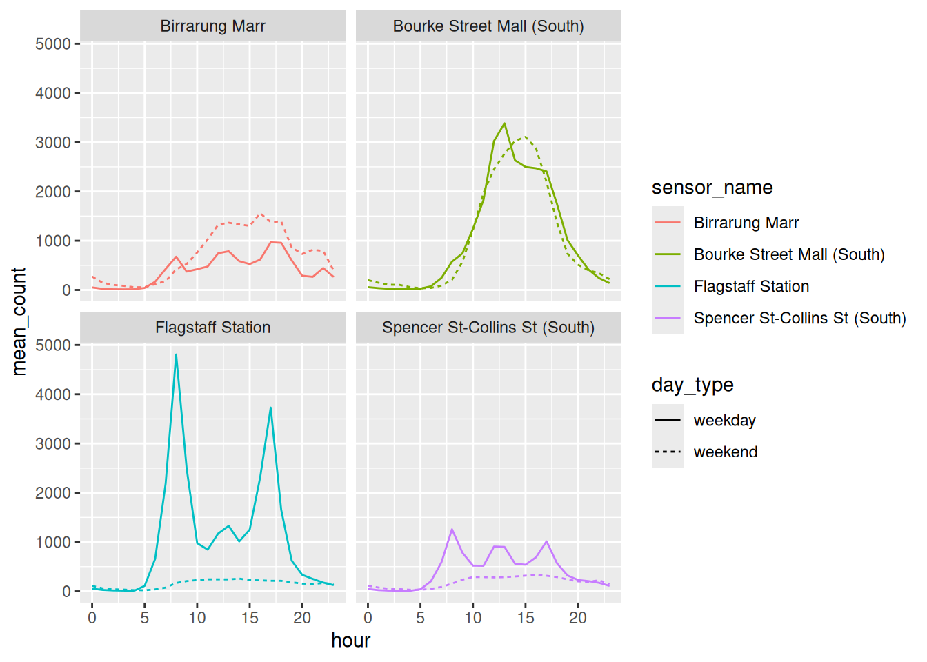
Same data, same aesthetics, same geom. The only new thing is facet_wrap(vars(sensor_name)), which says draw one panel per sensor.
Now:
Where is busy on a weekend?
We can see clearly now that Birrarung Marr is the only one where it sits above the solid line, and you can see that without tracking anything across a legend.
When you split plots up like this, you lose some context, as you cannot easily compare plots to each other.
library(tidyverse)
library(naniar)
pedestrian_hourly <- pedestrian |>
        # a weekday/weekend column. The only two days starting with
        # "S" are the two we want
        mutate(day_type = if_else(
                condition = str_starts(week_day, "S"),
                true = "weekend",
                false = "weekday"
                )
        ) |>
        group_by(sensor_name, day_type, hour) |>
        summarise(
                mean_count = mean(hourly_counts, na.rm = TRUE),
                .groups = "drop"
        )

pedestrian_hourly
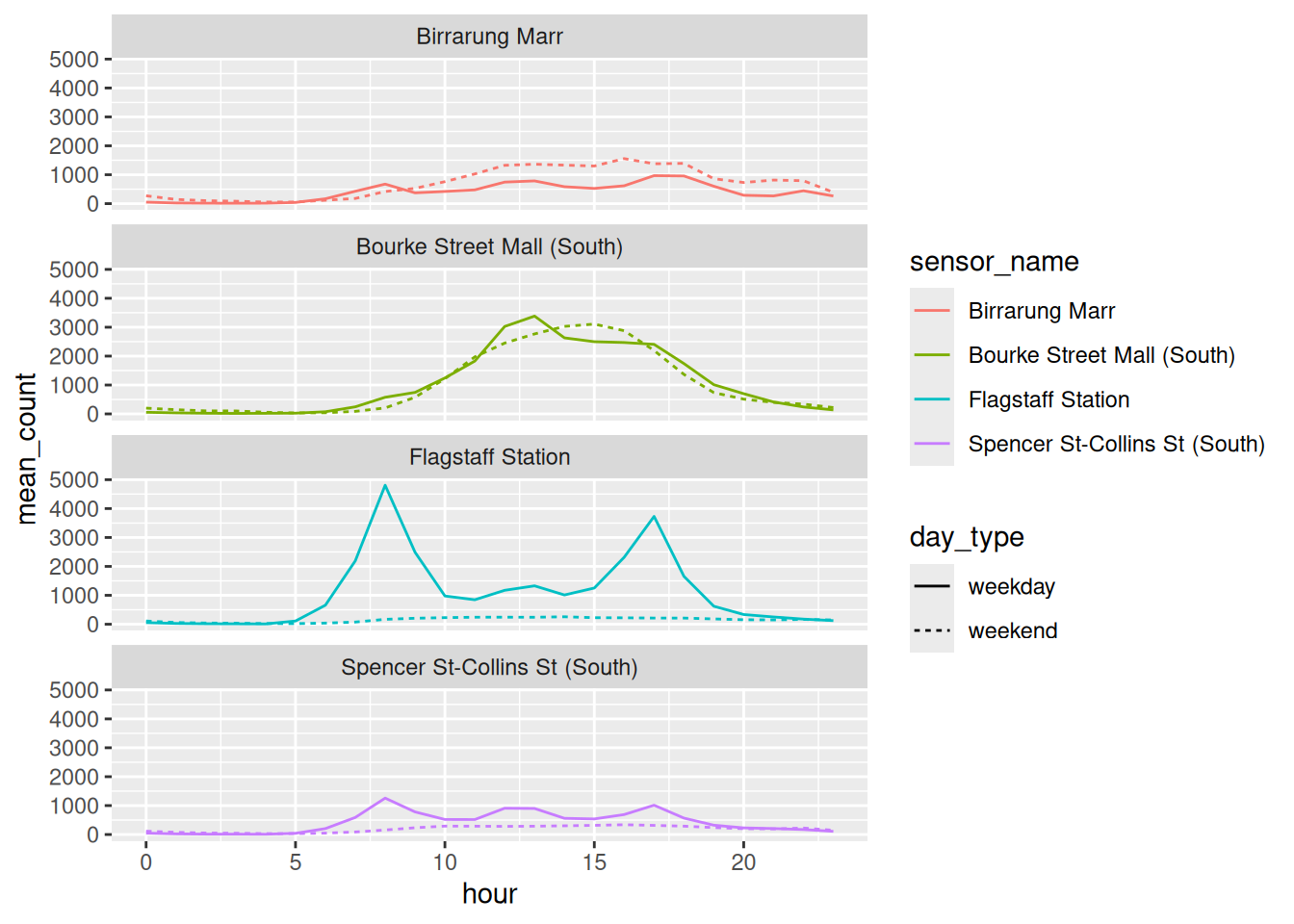
Is there a way you can do you think you could arrange these plots so you can more easily compare the x and y axes? How would you imagine this?
Answer
vars(), and the ~ you will see elsewhere
vars() is there because sensor_name is a column name. You use vars() in a similar way to how you use aes(): you refer to columns from the data frame inside of it.
There is an older way of writing this, with a tilde:
That is a formula, and it does the same job here. You will see it in other people’s code and in older blog posts, so it is worth recognising.
I teach vars() first because I think it is more consistent with the rest of the tidyverse. The tilde only works in some of those places.
Both are fine, though! Just make sure you are consistent - don’t mix ~ and vars() usage.
Since each panel now holds exactly one sensor, mapping sensor_name to colour as well is saying the same thing twice. We can use that colour on something else, instead - like day_type:
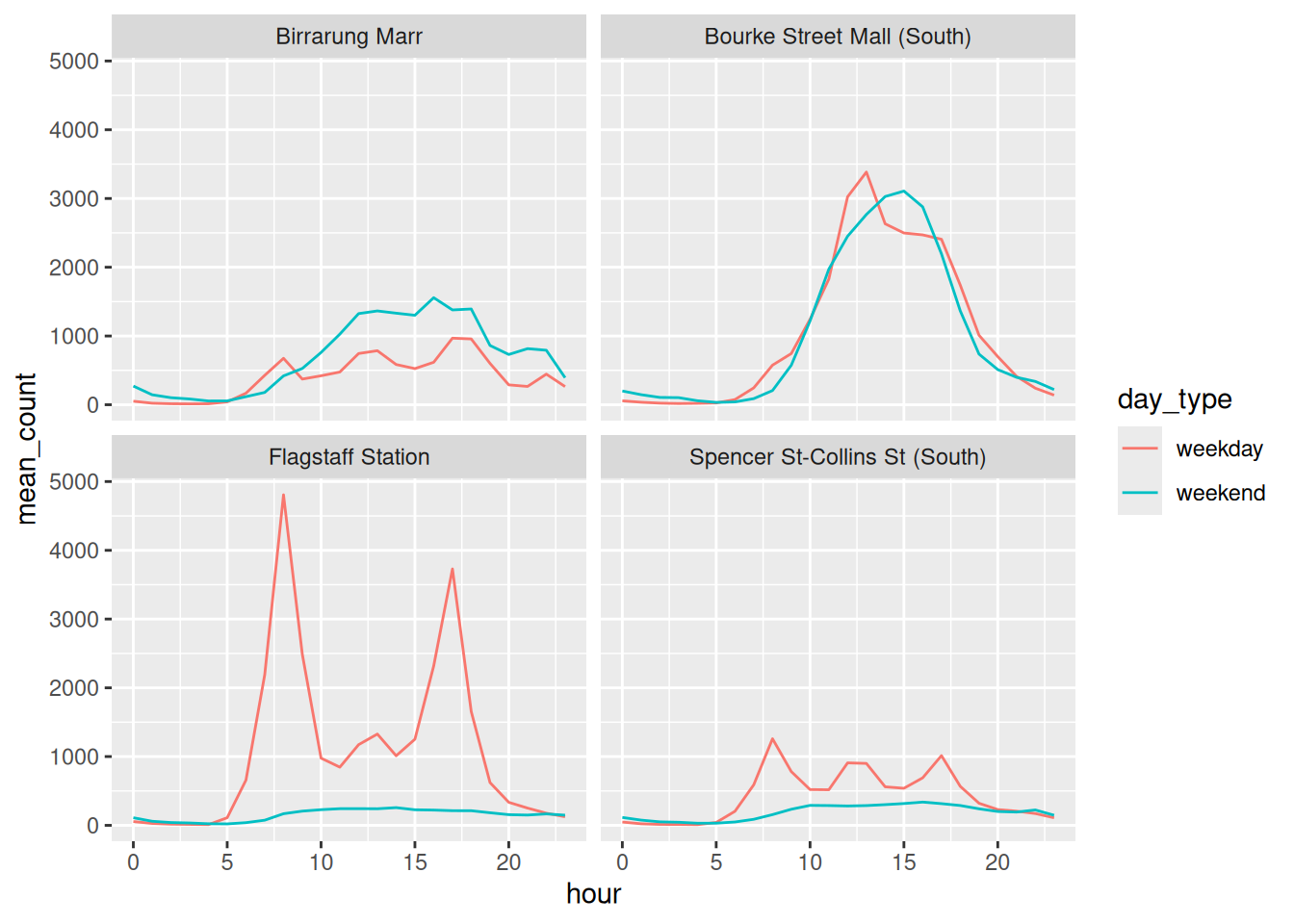
Two variables, with facet_grid()
facet_wrap() takes one variable and wraps the panels onto the page. facet_grid() takes up to two variables, and lays them out as rows and columns.
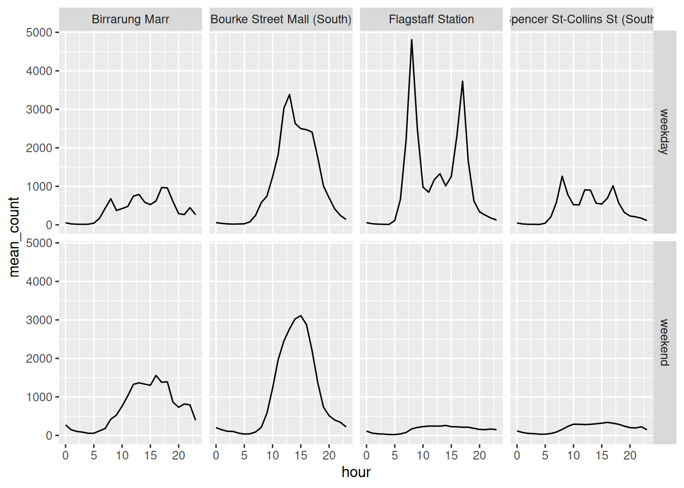
This gives us eight panels: two day types by four sensors.
Every panel shares its axes with its neighbours, which is what makes a grid worth using. Reading down a column compares weekday against weekend for one place. Reading across a row compares places for one kind of day.
Data for exercise
library(tidyverse)
library(naniar)
pedestrian_hourly <- pedestrian |>
        # a weekday/weekend column. The only two days starting with
        # "S" are the two we want
        mutate(day_type = if_else(
                condition = str_starts(week_day, "S"),
                true = "weekend",
                false = "weekday"
                )
        ) |>
        group_by(sensor_name, day_type, hour) |>
        summarise(
                mean_count = mean(hourly_counts, na.rm = TRUE),
                .groups = "drop"
        )

pedestrian_hourly
Which of the three plots above best answers “where is busy on a weekend”? Which best answers “what does Flagstaff do on a weekday”? Are they the same plot?
Swap the rows and columns in the grid:
Same information. Does it read differently?
- Try
facet_wrap(vars(sensor_name), ncol = 1). What does stacking the panels make easier, and what does it make harder?
4.5 Change comparisons
Everything above facets by sensor. Watch what happens if we facet by day type instead, and put sensor on colour.
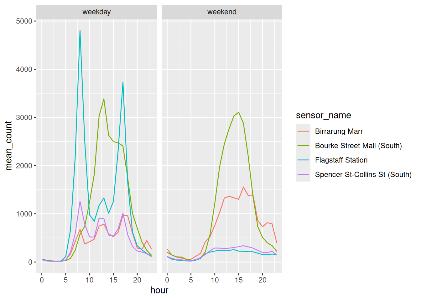
Now where is busy on a weekend is easy: look at the weekend panel and read the four lines against each other, all on one set of axes.
And what does Flagstaff do on a weekday got harder, because Flagstaff is now split across two panels and you have to hold one in your head while you look at the other.
Each arrangement is a tradeoff. The question is not:
“what is the right way to facet this”
It is:
what do I want the reader to compare
With only looking at the data, can you reacreate the plot?
library(tidyverse)
library(naniar)
pedestrian_hourly <- pedestrian |>
        # a weekday/weekend column. The only two days starting with
        # "S" are the two we want
        mutate(day_type = if_else(
                condition = str_starts(week_day, "S"),
                true = "weekend",
                false = "weekday"
                )
        ) |>
        group_by(sensor_name, day_type, hour) |>
        summarise(
                mean_count = mean(hourly_counts, na.rm = TRUE),
                .groups = "drop"
        )

pedestrian_hourly# A tibble: 192 × 4
sensor_name day_type hour mean_count
<chr> <chr> <int> <dbl>
1 Birrarung Marr weekday 0 51.6
2 Birrarung Marr weekday 1 22.7
3 Birrarung Marr weekday 2 14.8
4 Birrarung Marr weekday 3 12.7
5 Birrarung Marr weekday 4 14.4
6 Birrarung Marr weekday 5 41.8
7 Birrarung Marr weekday 6 168.
8 Birrarung Marr weekday 7 428.
9 Birrarung Marr weekday 8 676.
10 Birrarung Marr weekday 9 373.
# ℹ 182 more rows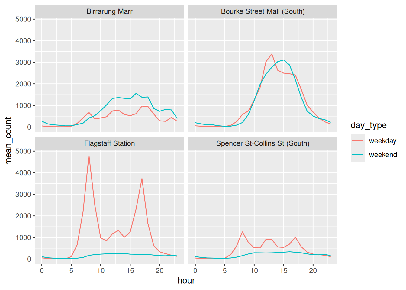
Sometimes you want to change the scale for each sub plot - you can do this with scales = "" option:
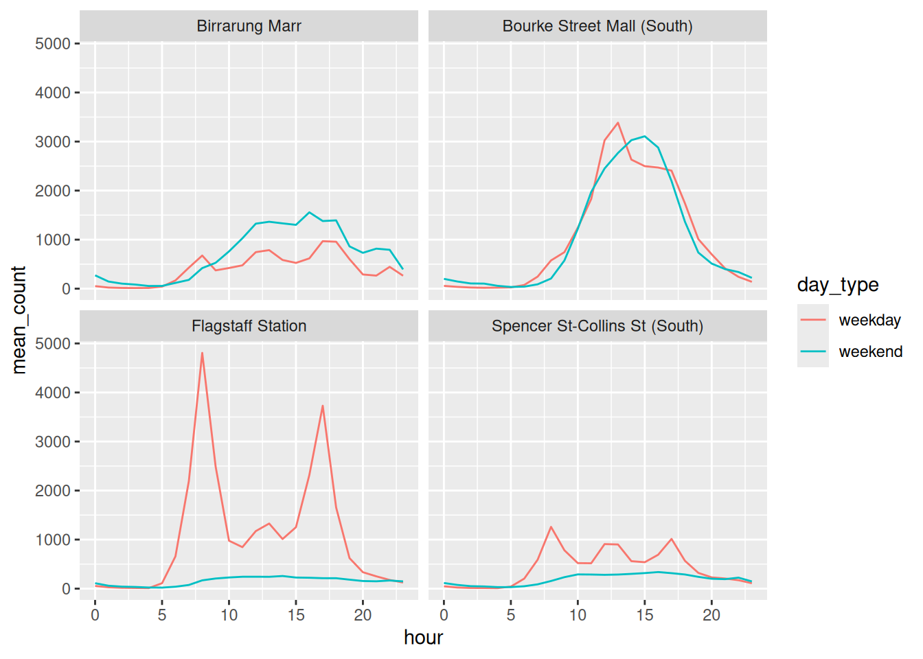
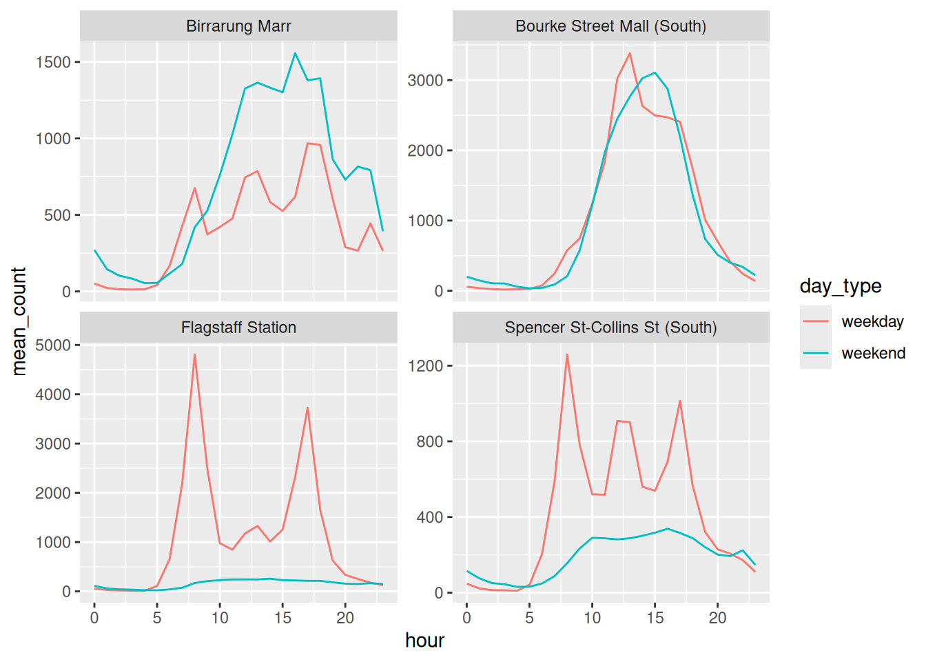
The shapes become a bit more legible!
As a general rule, using free scales is best used when the question is about caring about individual shape within each panel, and not about comparing across panels
library(tidyverse)
library(naniar)
pedestrian_hourly <- pedestrian |>
        # a weekday/weekend column. The only two days starting with
        # "S" are the two we want
        mutate(day_type = if_else(
                condition = str_starts(week_day, "S"),
                true = "weekend",
                false = "weekday"
                )
        ) |>
        group_by(sensor_name, day_type, hour) |>
        summarise(
                mean_count = mean(hourly_counts, na.rm = TRUE),
                .groups = "drop"
        )

pedestrian_hourly- Which question does the free-scale version answer better? Which does it answer worse?
- Try
scales = "free_x"andscales = "free". Do either make sense here?
We have now hit sawtoothing three times, in three chapters, and fixed it three different ways. It’s worth putting them side by side, because they aren’t equivalent and I keep having to choose between them.
A sawtooth always means the same thing: more than one y for each x, inside what ggplot2 thinks is one group. So the line runs out to the right, comes back, and does it again.
Tell it about the group. group = species in Chapter 2, group = hour in Chapter 3. Keeps every value you have. Needs a column worth grouping by, and few enough groups that you can still see them.
Summarise. One number per group per x, which is what we just did to get those eight lines. Clean, and you’ve thrown the variation away. That is exactly what the 8am box warned about in Chapter 3: a mean that describes no morning that ever happened.
Take a subset. Keeps the raw numbers, at the cost of only answering about the part you kept. We don’t do that in this chapter, and it is worth seeing why.
Look at the first week of January at Flagstaff Station, at 8am:
| day | 8am count |
|---|---|
| Friday 1 January | 49 |
| Saturday 2 January | 91 |
| Sunday 3 January | 74 |
| Monday 4 January | 2946 |
| Tuesday 5 January | 3136 |
| Wednesday 6 January | 3242 |
| Thursday 7 January | 3435 |
Friday the 1st is a weekday by our definition, and 49 people turned up. It’s New Year’s Day. Our day_type column calls it a working day and the sensor disagrees.
Nothing is broken. The subset is just small enough that one public holiday is a fifth of our weekdays.
I use all three of these. What I try not to do is pick one without noticing that I picked it.
For a longer worked example of hunting one of these down, see Just Quickly: Removing Sawtooth Patterns in Line Graphs.
The dodged bars made the comparison. They are still hard to read a number off.
ggplot(pedestrian_totals,
       aes(x = total,
           y = fct_reorder(sensor_name, total),
           fill = day_type)) +
        geom_col(position = "dodge") +
        scale_x_continuous(
                labels = scales::label_number(scale = 1e-6, suffix = "M")
        ) +
        labs(x = NULL, y = NULL, fill = NULL) +
        theme_minimal() +
        theme(legend.position = "top",
              panel.grid.major.y = element_blank())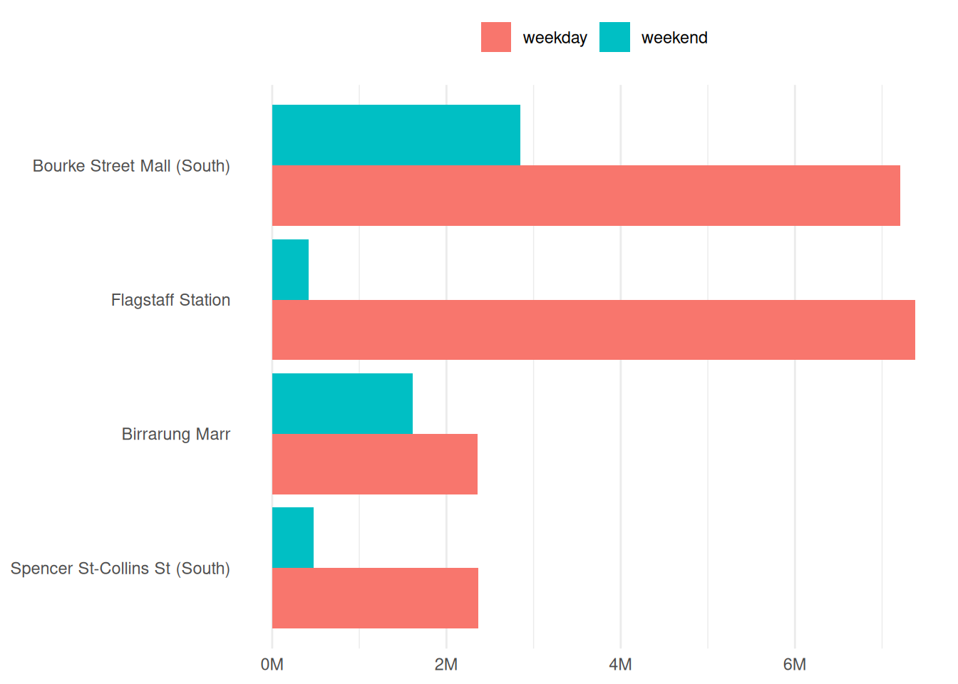
- Sort the bars. Alphabetical is not an order. This is Chapter 6’s argument, and it costs one function.
label_number(scale = 1e-6, suffix = "M")because nobody reads7000000.- Drop the horizontal grid lines. On a bar chart they cross the bars and add nothing, since the bars already start from a common baseline.